.png)
At Kiandra, we love Power BI, an incredibly useful tool for businesses to begin visualising and drawing meaningful insights from data. From integrating it into our larger software projects as an analytics tool, to creating custom dashboards using our clients' existing data feeds, we think it’s a great tool for businesses to begin their data visualisation journey.
In a previous blog, we discussed the questions your business should ask when considering Power BI. Now, let’s take a closer look at how to get started creating your first Power BI dashboard.
Getting Started
The Power BI Desktop application can be downloaded for free from the Windows Store here. This application, which has a user interface that will look familiar to Microsoft Excel users, will be our Integrated Development Environment for our dashboards. Once installed, users will see a screen like the image shown below. This is our blank canvas!
Integrating Your First Data Source
Power BI supports a wide range of data sources: Plain text files, Excel, database engines, online services, among others. Users can choose to get their data from one single data source (e.g. the tables from a MS SQL Server database) or from a combination (e.g. a CSV file, a MS SQL Server database, and an online web service) of sources. They can later user Power BI’s data transformation capabilities to create links between these otherwise unconnected data sources.For this article, I’ll use a MS Excel file as our data source. To add a data source, let’s click on the Get Data button, select Excel and click on the Connect button, as shown in the image below:
Power BI will read the datasheets in the Excel file. Once a datasheet is selected, it will also read its contents, automatically detect the column headers and display a preview of the data.
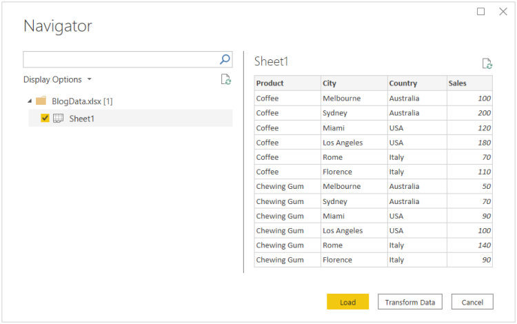
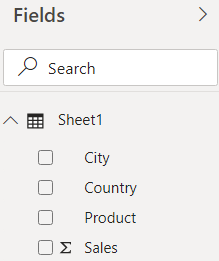
To finalise the wizard, let’s click on the Load button. This will generate a data source and display its fields in the right-hand side Fields menu.
Creating Your First Visualisation
With our data source loaded, let’s create our first visualisation. Power BI offers a good range of built-in visualisations that should be able to cover most use cases. The platform also features an external repository called AppSource where users can find components built by third party partners or developers can also build their own by using Power BI’s custom visuals SDK.To begin, click on the icon of the desired component in the right-hand side Visualisations panel. For this article I’ll pick a clustered bar chart.

With the visualisation selected, click on the columns you want to display. For this one I’ll select Country, Product and Sales into the Axis, Legend and Value placeholders respectively, as you can see below:

After performing these short steps, Power BI will render a graph as shown below:

Each component has certain parameters that can be customised. With bar charts, for instance, you can change the legend position, colours and text styles among others. To customise a visualisation, select it, and then click on the Format button in the Visualisations panel:

Publishing Your First Power BI Dashboard
Once ready, users can deploy the dashboard to the Power BI website by clicking the Publish button in the main ribbon, as shown in the image below. This action will prompt the login screen (if you haven’t logged in already), and will publish the report file, data sources, and all relevant assets to the Power BI website.

Publishing requires a Power BI license. At the time of writing, licensing comes in two flavours: Pro and Premium. The main difference between these two is that Pro is licensed on a per-user basis and is generally cheaper, while premium includes dedicated computing and storage resources at a much more expensive price point. This table contains a side-by-side comparison.
Congratulations, you’ve created your first Power BI dashboard! You’re now ready to begin presenting informative data and getting real insights from your data. The good news is we’ve barely scratched the surface of what Power BI has to offer, so when you’re ready to take your visualisation to the next level – more customisation, more data feeds and more insights, we’d love to help. Just get in touch.
Related Posts


Let’s build your competitive edge
Tell us about your project for a no-obligation consultation.